
WERK No. 35
WERK No. 35: The Value of the Unresolved
Despite the evolving culture of graphic design, standard definitions continue to describe it primarily as a practice of visual communication intended to transmit specific messages with specific objectives. This definition leaves little room for design as inquiry, speculation, or unresolved thinking. It reinforces a culture in which graphic design is judged primarily by clarity, efficiency and utility—values that choose resolution over exploration.
Consequently, coming across Theseus Chan’s WERK Magazine is that much more unusual. It occupies a critical place in the landscape of design publishing, continually asking not only what graphic design can do, but what it can be. Discovering its 25th commemorative issue, WERK No. 35 made me reconsider how my own creative journey intersects with its philosophy.
Encountering WERK No. 35 felt like stumbling into a parallel version of the design world I once imagined, but never fully entered. I discovered it by chance through an email from Dover Street Market Ginza, and the impact was immediate. I trained as a graphic designer, with visual arts as my minor. As a newcomer to Canada, building a life on my own, I chose stability: I put my art aspirations aside and started my practice in graphic design. In doing so, I signed an invisible contract with the commercial arts and decided not to challenge the field publicly, radically, or materially the way Chan has done for decades. WERK No.35 stunned me not simply because of its aesthetics, but because it revealed a direction I had long struggled taking: one where design operates as experiment, inquiry, rebellion and personal philosophy.
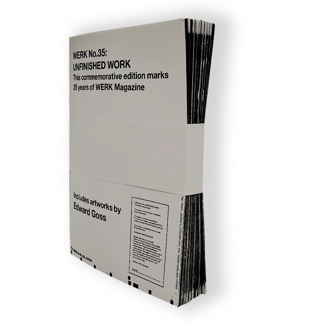
Chan’s commitment to “unfinished work” struck me. His formats resist closure and refuse perfection, confronting the instinct many designers carry: to polish, resolve, finalize and to gain professional validation. The unbound, untrimmed, hand-collated signatures of WERK No.35 do the opposite. High-contrast, black-and-white prints overlaid with handwritten and deconstructed type generate disorder on one side and an unexpected sense of release from commodification on the other. The work chooses process over product, inquiry over certainty.
Chan captures this material intensity in his own words:
“The ink was printed so heavily, it acted like glue, fusing the sheets together as they came off the press. Bleeding off the edges. Two passes of black as if black alone wasn’t
enough.”
The publications embody what I’ve always sensed but rarely articulated: that design, like art, can function as a form of contemplation rather than communicating, a space for perception rather than promotion or perfection.
WERK bridges worlds I inhabit but rarely allow to overlap. It merges art, design and psychological inquiry in ways that feel both intuitive and disruptive. It engages with the disciplines without diluting any of them. Its limited edition of 300 copies underscores its philosophy: imperfection, scarcity and process may hold more value than polish or permanence. Chan asks whether design can exist as a living process rather than a perfected artifact.
The title adds another layer. “WERK” in German denotes a finished work, a creation, an opus. Yet, the only elements in WERK No.35 that appear complete are the covers: left-aligned type, minimal and deliberately withholding. The crop and registration marks framing them introduce gestures toward incompleteness that are only fully revealed inside the magazine. Even the careful handling instructions create a paradox: a publication rooted in process that must be treated like a polished, archival object. This messy work-in-progress also asks to be treated as a precious object.
Rather than undermining WERK’s philosophy, this contradiction may be its most honest expression: a recognition that experimental work must still exist within systems of value, preservation and exchange.
Discovering the work of Toronto Neo-Expressionist, self-taught artist Edward Goss–someone I had never encountered despite living in the same city–reinforced how easily resonant voices can remain unseen unless we stay open to influences beyond our familiar territories. Goss’s experimental studies of chaotic repetitive letterforms correlate with Chan’s unspoken ethos. Both practices operate outside dominant visibility while questioning how meaning accumulates through repetition and imperfection. WERK reminded me that influence often arrives sideways, unplanned.
WERK No. 35 prompted a reconsideration of my own creative trajectory. Its spirit of risk, its refusal to play by established rules echo everything that originally drew me to design, and everything I now explore through my own experimental work. The issue embodies something I've always understood psychologically, but only recently recognized as essential in the visual field: the value of the unresolved, the evolving, the perpetually questioning.
This tension between perfection and process lies at the heart of every creative work. WERK No. 35 affirms that embracing it is not a contradiction, but a practice. Chan’s publication leaves audiences with a question: what does design lose by avoiding this tension, and what does it gain by embracing it?
MORE FROM ARTS & LABOUR:
- Nalini Malani: Of Woman Born
- WOO Stories: Beyond Patterns
- Ruth Asawa: The Forms of Persistence
Consequently, coming across Theseus Chan’s WERK Magazine is that much more unusual. It occupies a critical place in the landscape of design publishing, continually asking not only what graphic design can do, but what it can be. Discovering its 25th commemorative issue, WERK No. 35 made me reconsider how my own creative journey intersects with its philosophy.
Encountering WERK No. 35 felt like stumbling into a parallel version of the design world I once imagined, but never fully entered. I discovered it by chance through an email from Dover Street Market Ginza, and the impact was immediate. I trained as a graphic designer, with visual arts as my minor. As a newcomer to Canada, building a life on my own, I chose stability: I put my art aspirations aside and started my practice in graphic design. In doing so, I signed an invisible contract with the commercial arts and decided not to challenge the field publicly, radically, or materially the way Chan has done for decades. WERK No.35 stunned me not simply because of its aesthetics, but because it revealed a direction I had long struggled taking: one where design operates as experiment, inquiry, rebellion and personal philosophy.
Chan’s commitment to “unfinished work” struck me. His formats resist closure and refuse perfection, confronting the instinct many designers carry: to polish, resolve, finalize and to gain professional validation. The unbound, untrimmed, hand-collated signatures of WERK No.35 do the opposite. High-contrast, black-and-white prints overlaid with handwritten and deconstructed type generate disorder on one side and an unexpected sense of release from commodification on the other. The work chooses process over product, inquiry over certainty.
Chan captures this material intensity in his own words:
“The ink was printed so heavily, it acted like glue, fusing the sheets together as they came off the press. Bleeding off the edges. Two passes of black as if black alone wasn’t
enough.”
The publications embody what I’ve always sensed but rarely articulated: that design, like art, can function as a form of contemplation rather than communicating, a space for perception rather than promotion or perfection.
WERK bridges worlds I inhabit but rarely allow to overlap. It merges art, design and psychological inquiry in ways that feel both intuitive and disruptive. It engages with the disciplines without diluting any of them. Its limited edition of 300 copies underscores its philosophy: imperfection, scarcity and process may hold more value than polish or permanence. Chan asks whether design can exist as a living process rather than a perfected artifact.
The title adds another layer. “WERK” in German denotes a finished work, a creation, an opus. Yet, the only elements in WERK No.35 that appear complete are the covers: left-aligned type, minimal and deliberately withholding. The crop and registration marks framing them introduce gestures toward incompleteness that are only fully revealed inside the magazine. Even the careful handling instructions create a paradox: a publication rooted in process that must be treated like a polished, archival object. This messy work-in-progress also asks to be treated as a precious object.
Rather than undermining WERK’s philosophy, this contradiction may be its most honest expression: a recognition that experimental work must still exist within systems of value, preservation and exchange.
Discovering the work of Toronto Neo-Expressionist, self-taught artist Edward Goss–someone I had never encountered despite living in the same city–reinforced how easily resonant voices can remain unseen unless we stay open to influences beyond our familiar territories. Goss’s experimental studies of chaotic repetitive letterforms correlate with Chan’s unspoken ethos. Both practices operate outside dominant visibility while questioning how meaning accumulates through repetition and imperfection. WERK reminded me that influence often arrives sideways, unplanned.
WERK No. 35 prompted a reconsideration of my own creative trajectory. Its spirit of risk, its refusal to play by established rules echo everything that originally drew me to design, and everything I now explore through my own experimental work. The issue embodies something I've always understood psychologically, but only recently recognized as essential in the visual field: the value of the unresolved, the evolving, the perpetually questioning.
This tension between perfection and process lies at the heart of every creative work. WERK No. 35 affirms that embracing it is not a contradiction, but a practice. Chan’s publication leaves audiences with a question: what does design lose by avoiding this tension, and what does it gain by embracing it?
MORE FROM ARTS & LABOUR:
- Nalini Malani: Of Woman Born
- WOO Stories: Beyond Patterns
- Ruth Asawa: The Forms of Persistence